THE SOLUTION
A device and viewport agnostic responsive web application that:
1) Allows admins and team leaders to build, assign, and track their eLearning Content and Employees so that the organization can professionally develop their people.
2) Allows employee eLearners to learn, train and professionally develop, so that they may more knowledgeably and skillfully execute their jobs.
Where we began: discovery, definition, scope
The project began with a series of client meetings to become immersed in the existing platform and define the scope of the project, who the users were, and what problems we could solve for. Project includes taking an existing out-of-date product, making it responsive, and improving the usability. Was this a full redesign or more of a reskin? A redesign from the ground up...
A quick whiteboard diagram understanding the general organizational structure of the types of companies the software will serve.
COMPETITIVE ANALYSIS
Many competing platforms exist both as SaaS and for general consumers. A somewhat brief survey and inventory was taken of their approaches. Special note was taken of any common attributes to include as design patterns that could be worth exploring.
PERSONAS AND JOURNEY MAPS HELP DEFINE THE THREE TARGET USERS
If budget would allow, it would have been preferable to conduct a more detailed inquiry/ethnography of the potential and previous users. Instead, we relied on the experience of the company's internal team with the many clients over the years as the basis for understanding the 3 general personas.
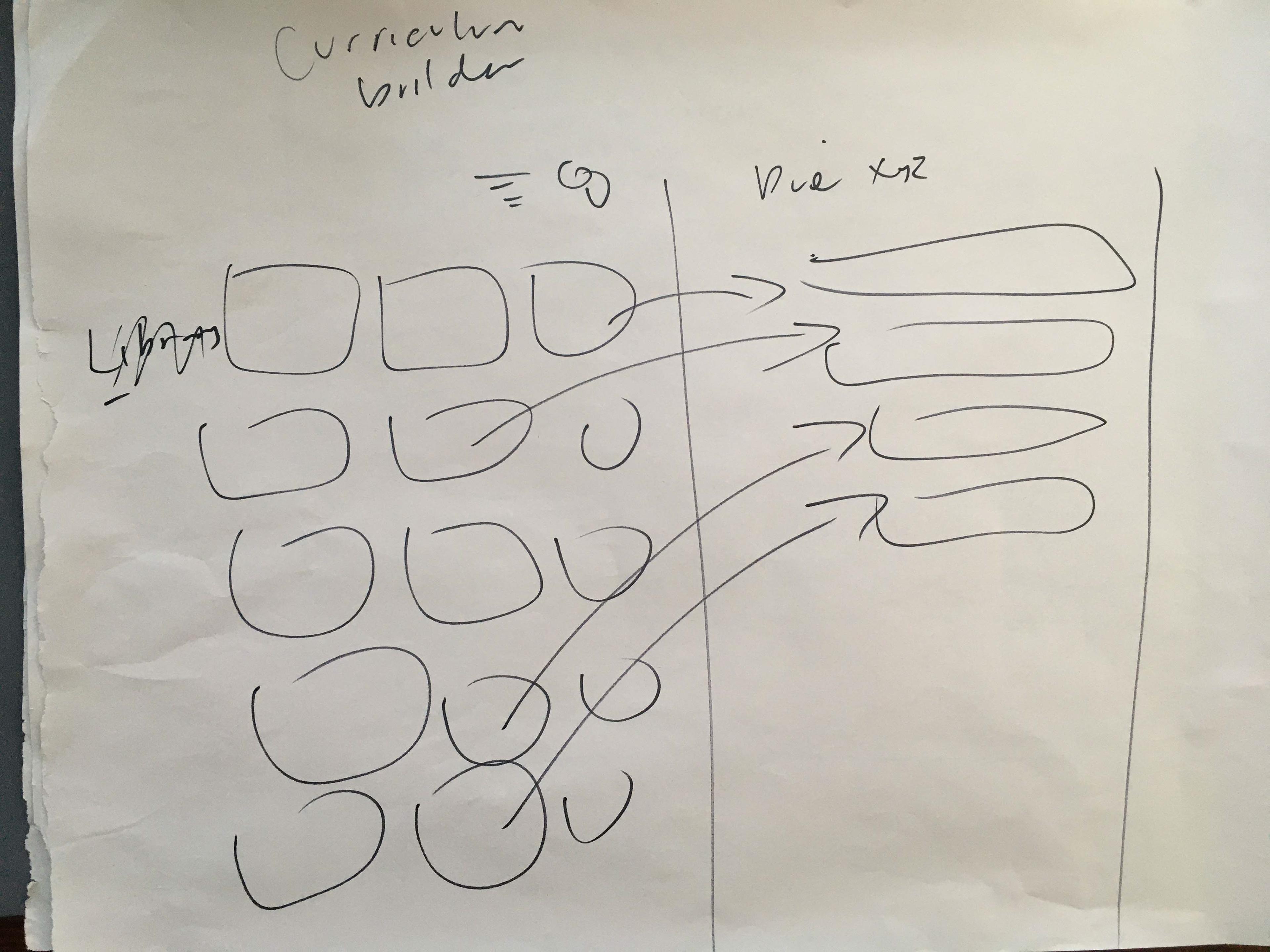
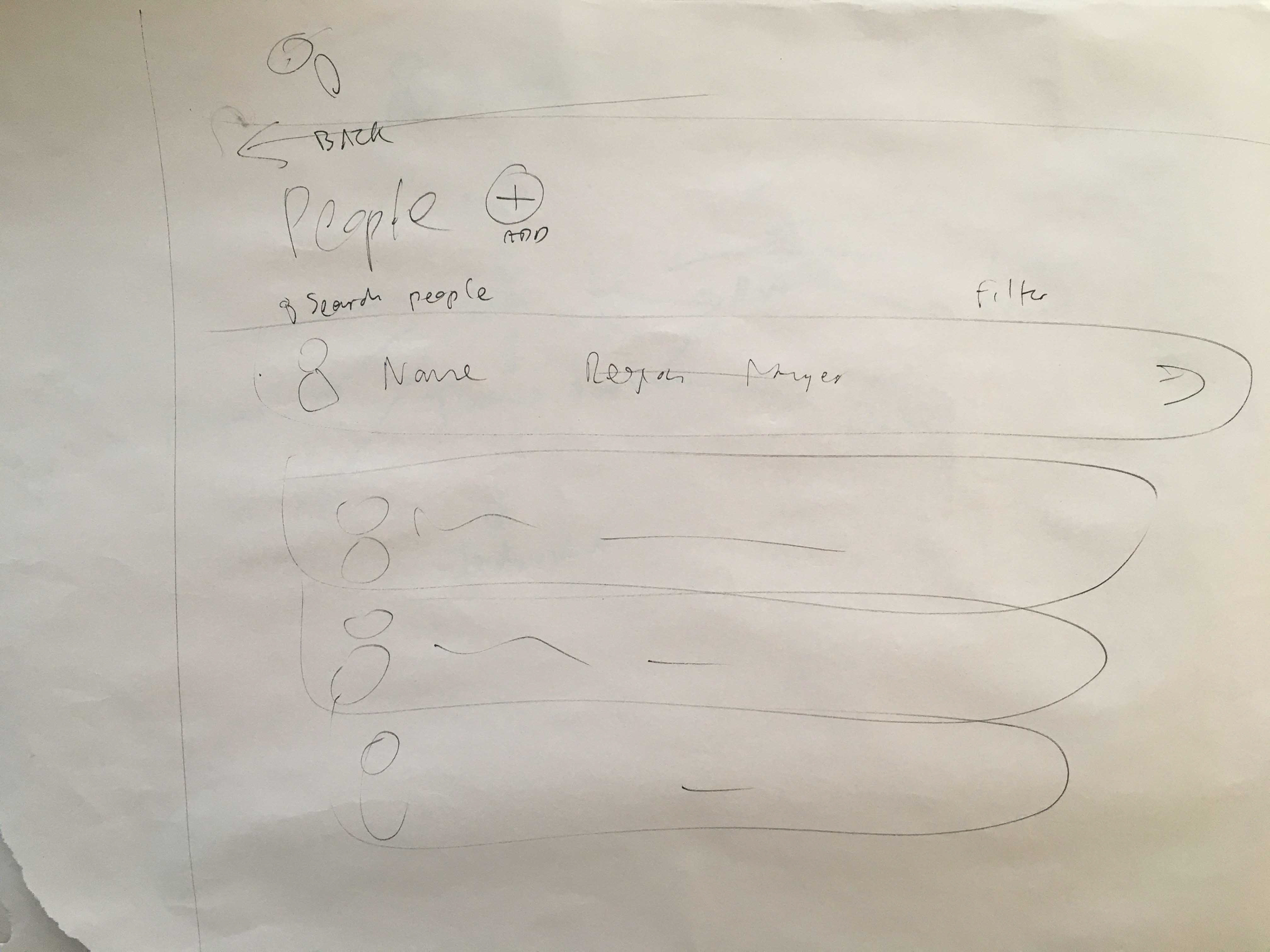
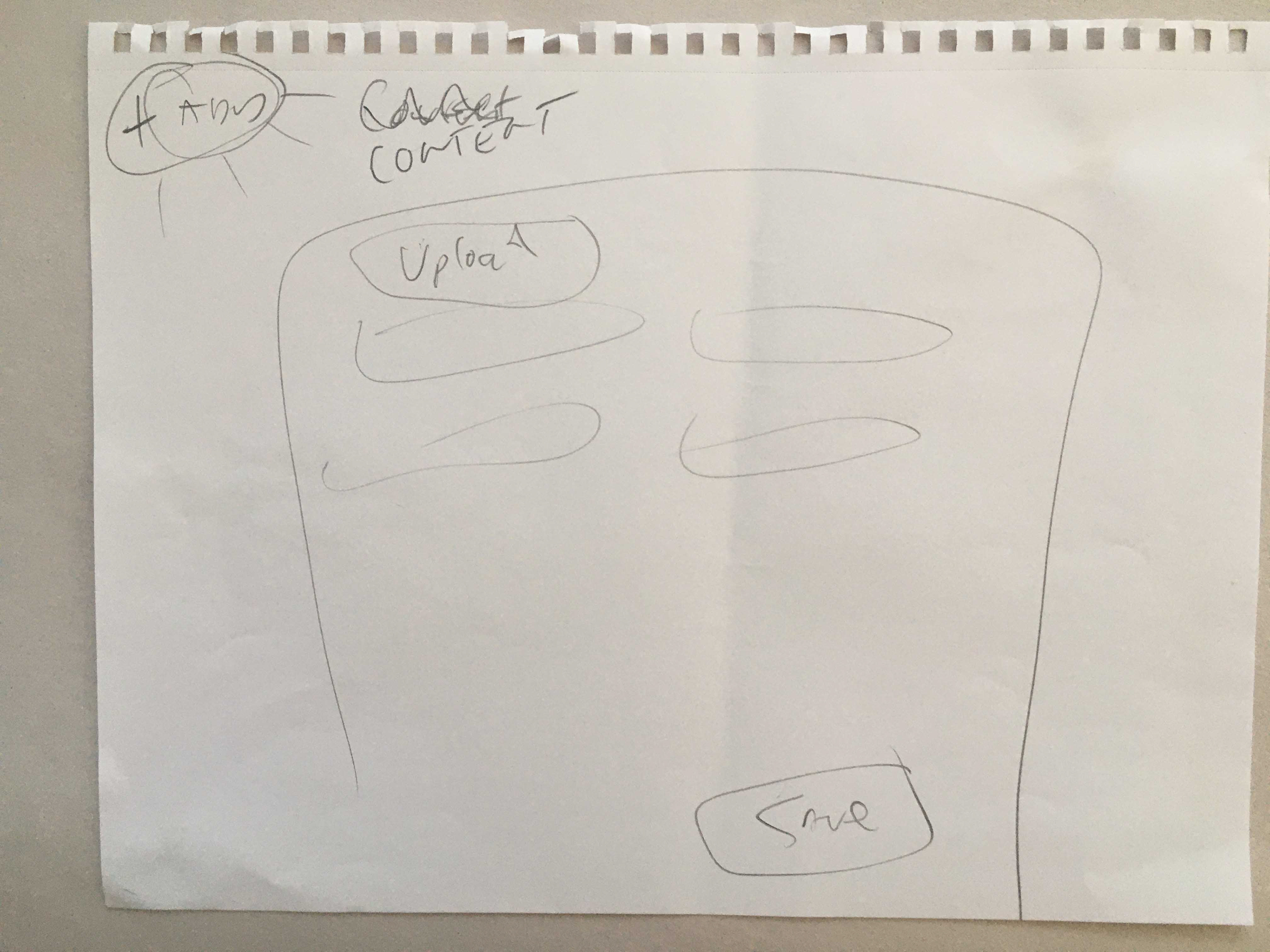
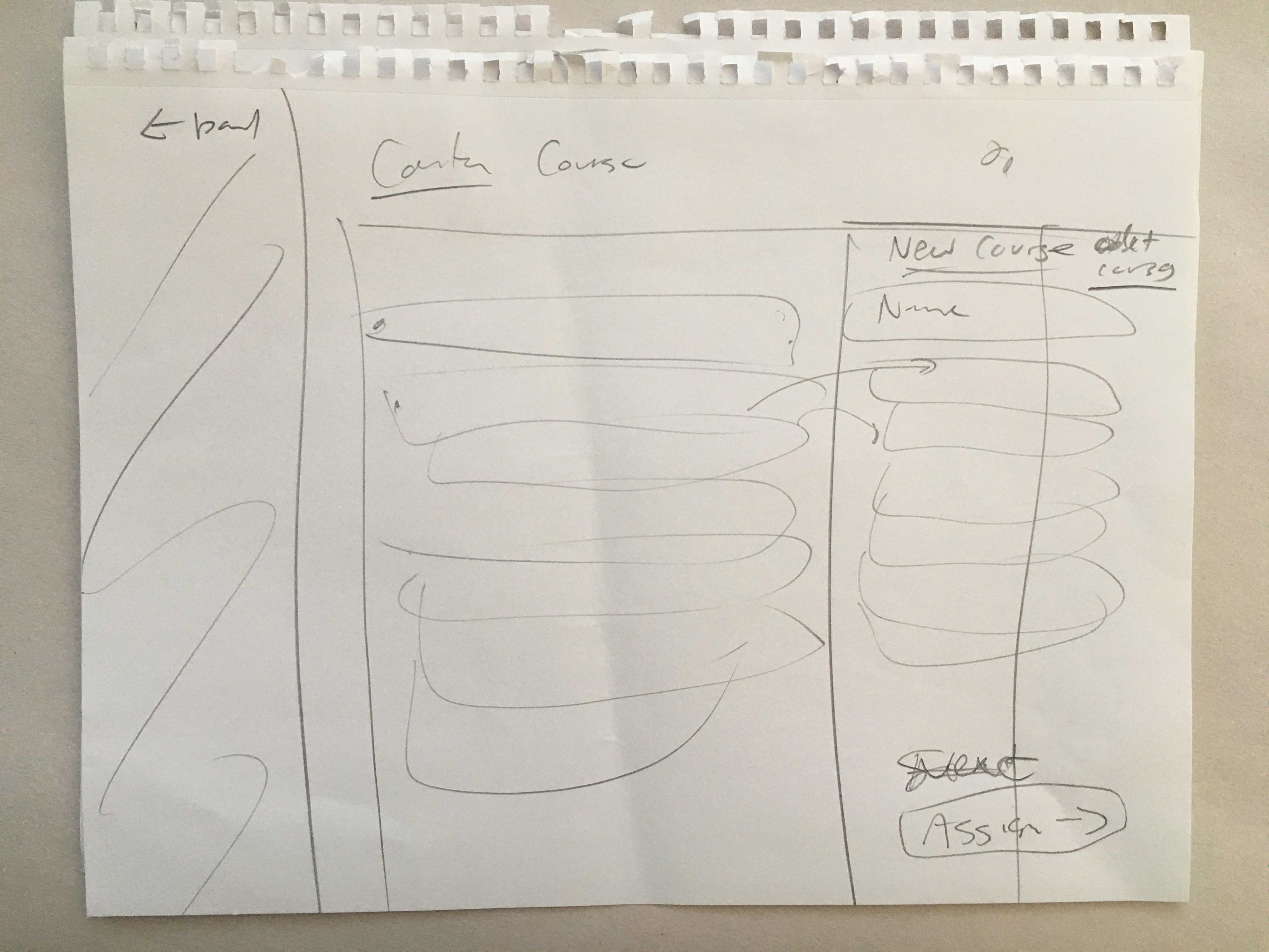
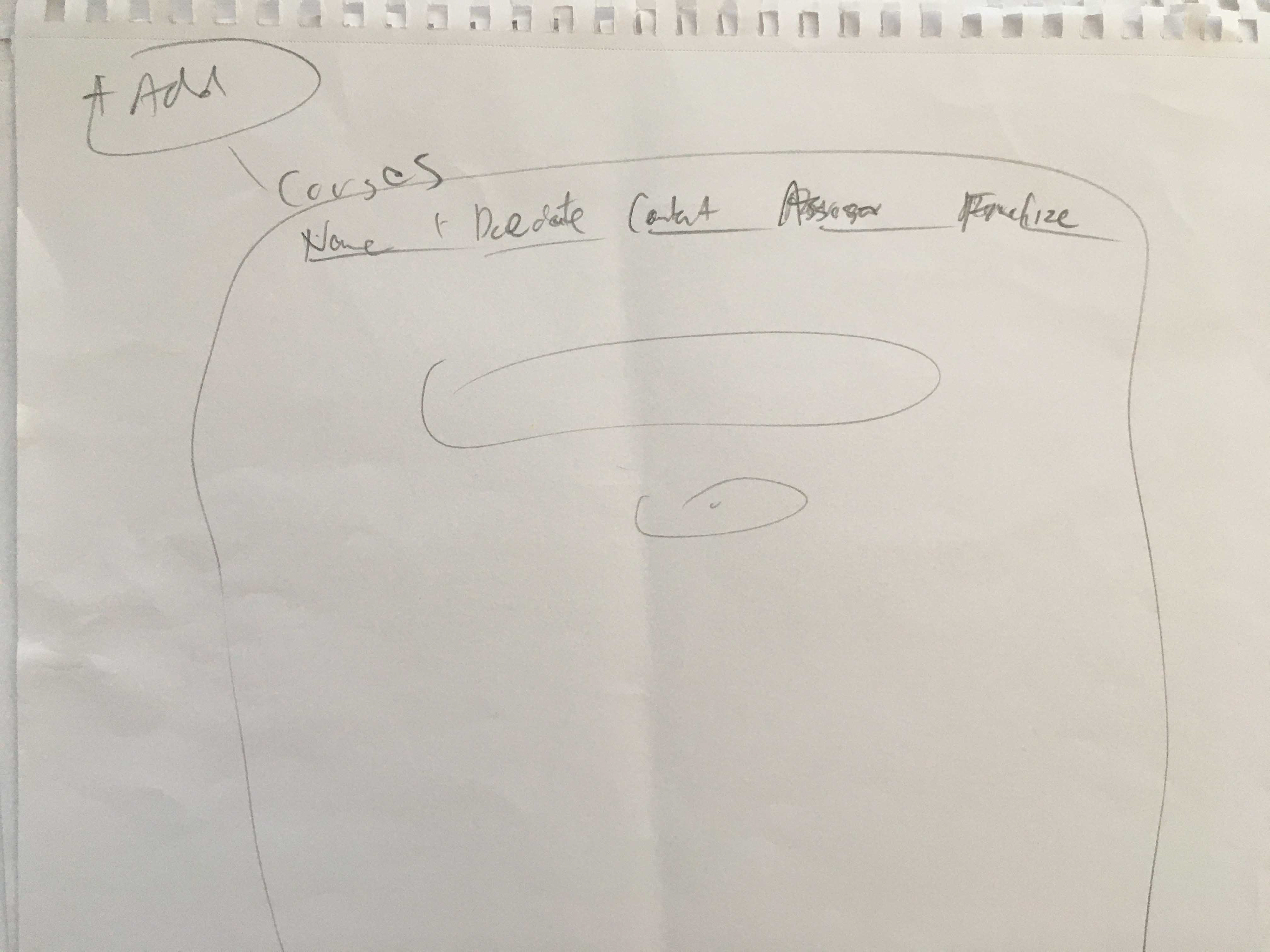
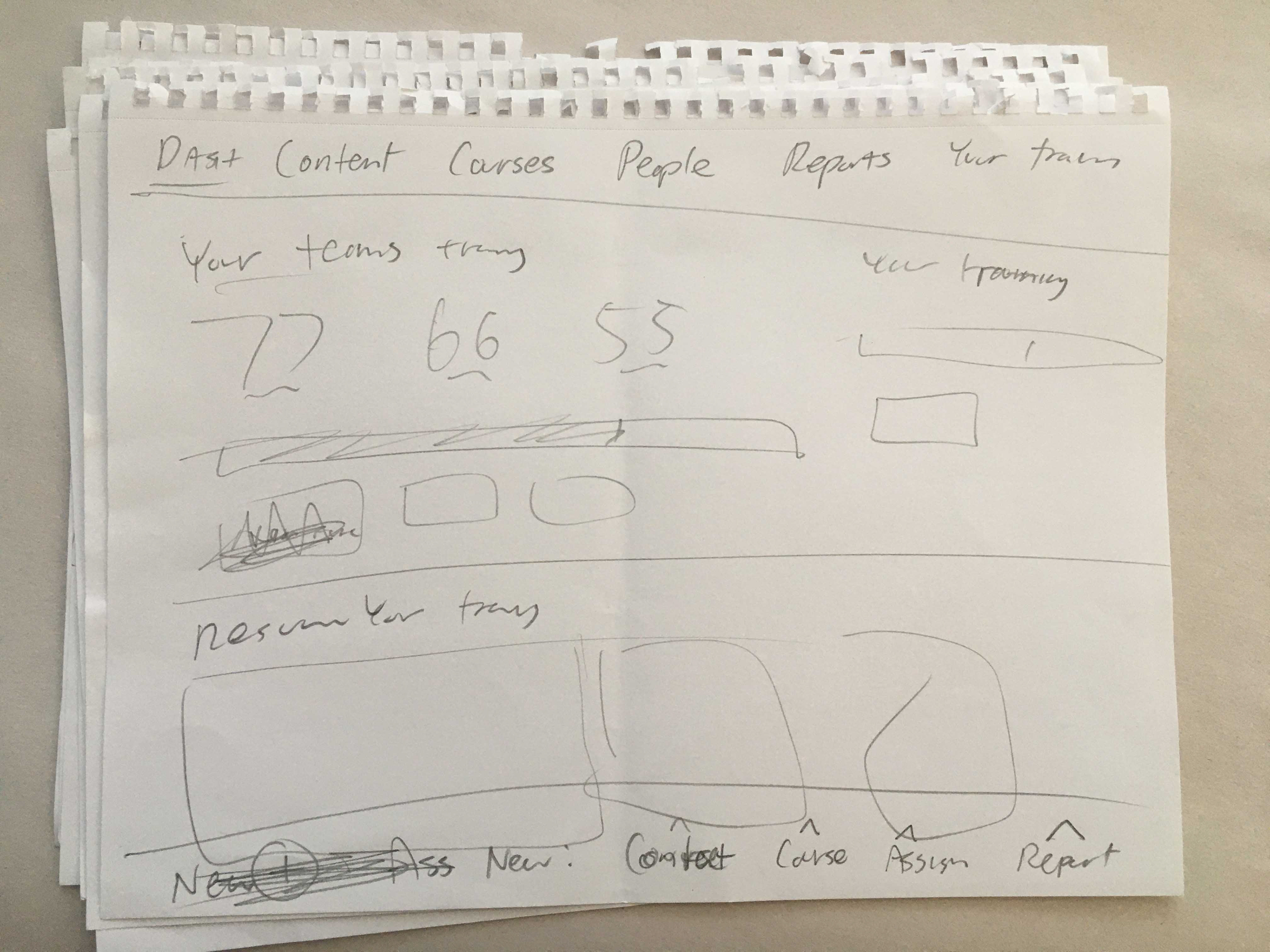
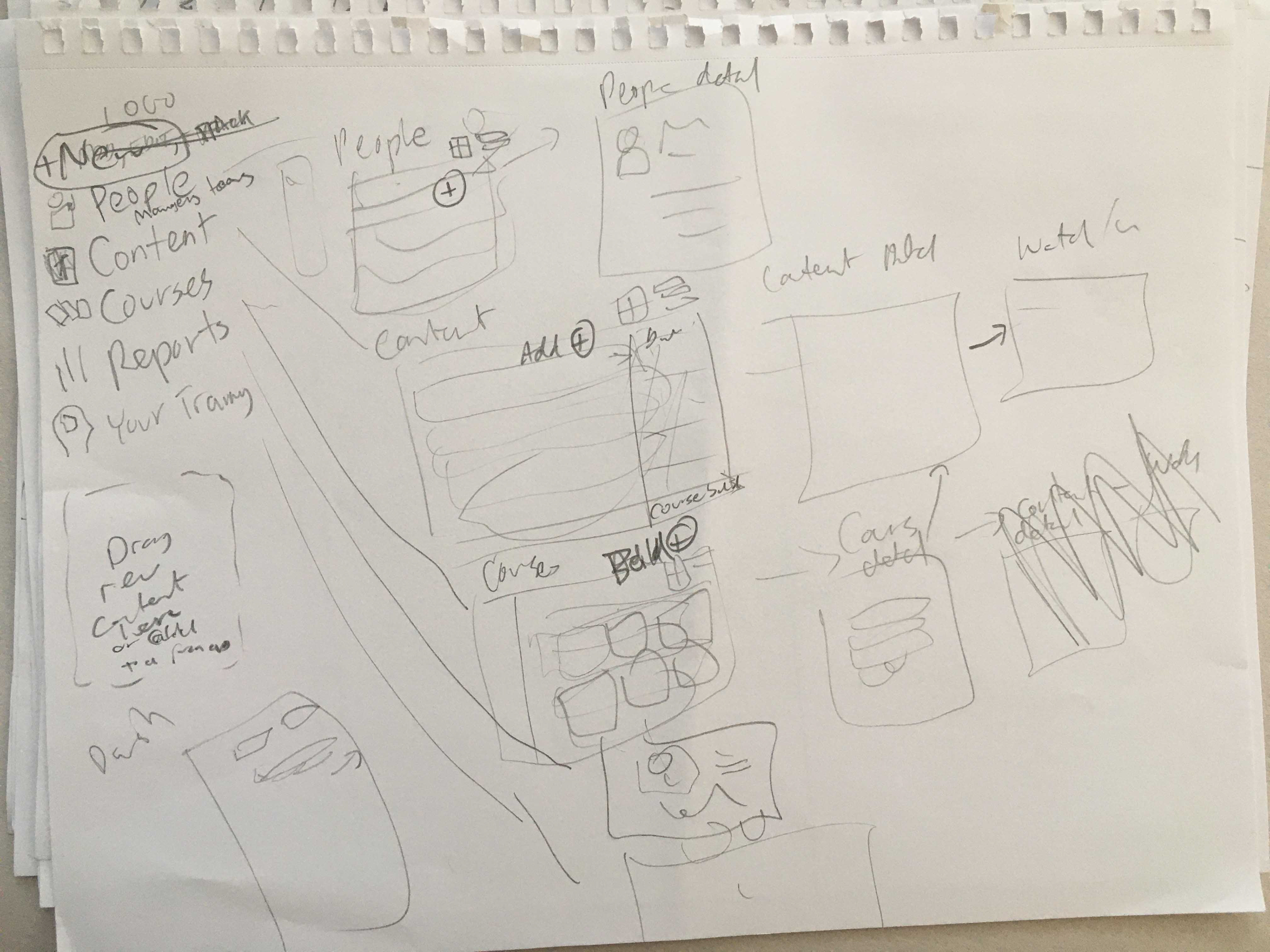
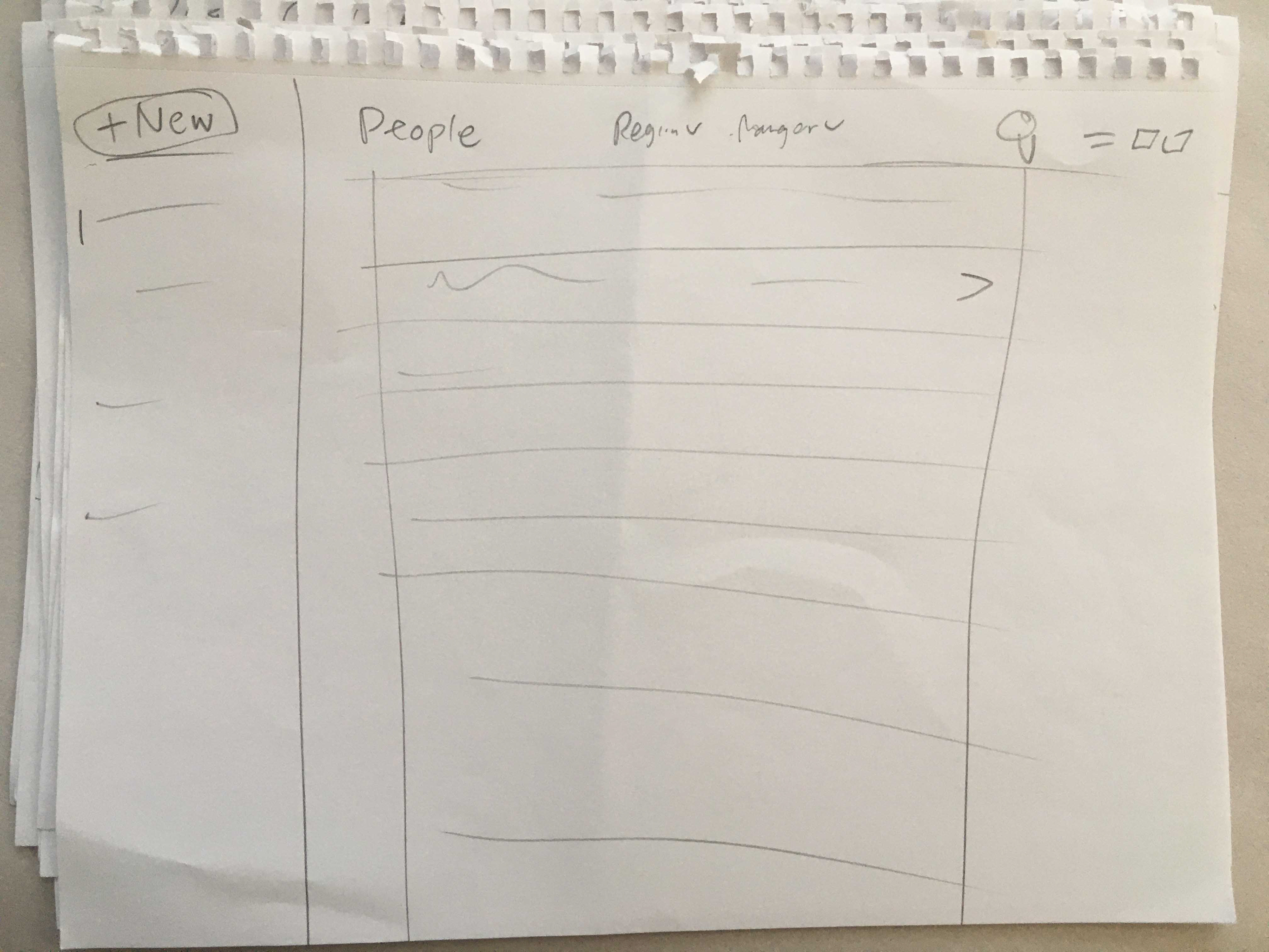
RAPID SKETCHING AND VISUALIZATION OF THE ENTIRE SYSTEM BASED ON THE JOURNEY MAPS (KEY SCREENS AND FLOWS + SITEMAPS)
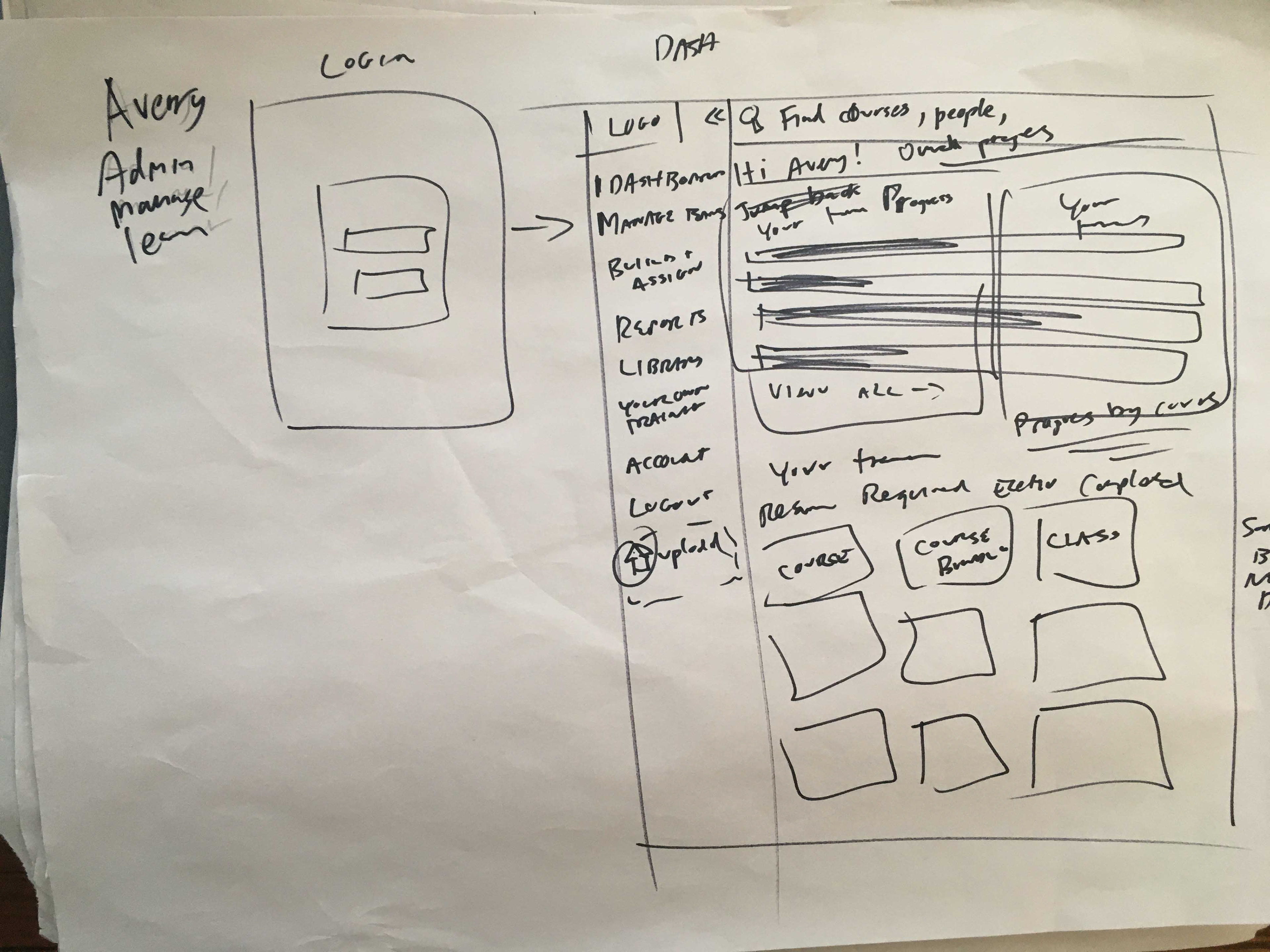
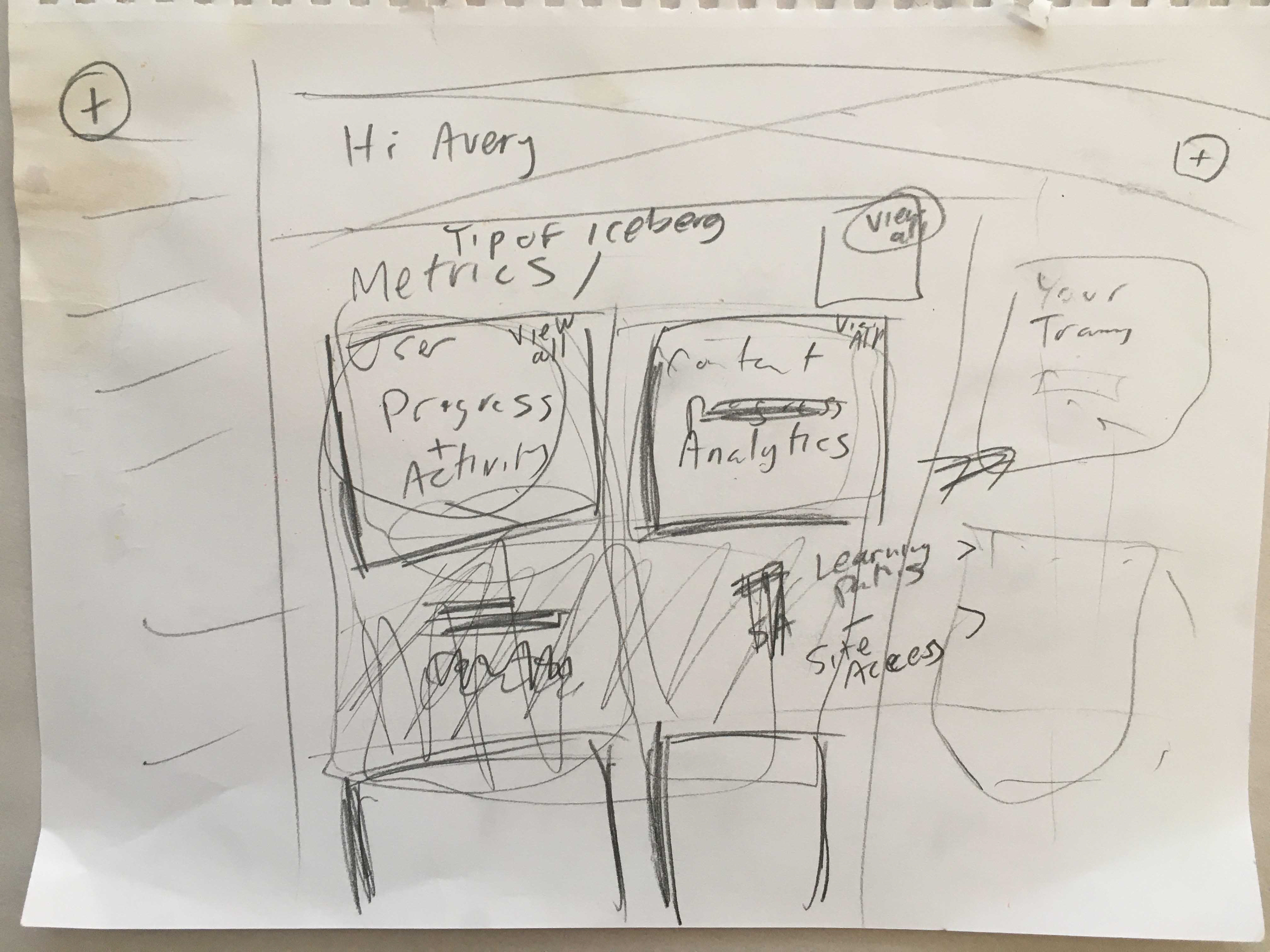
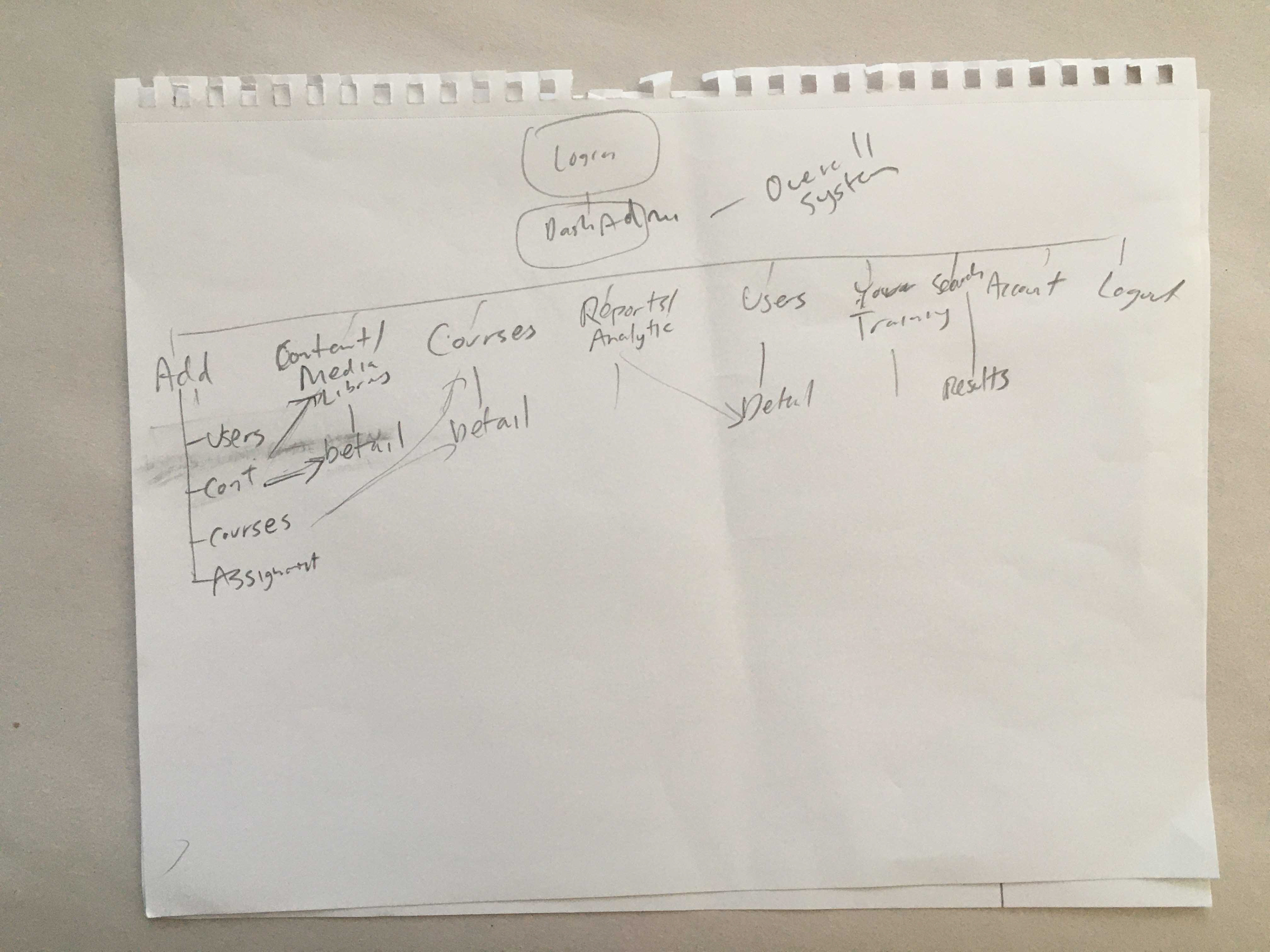
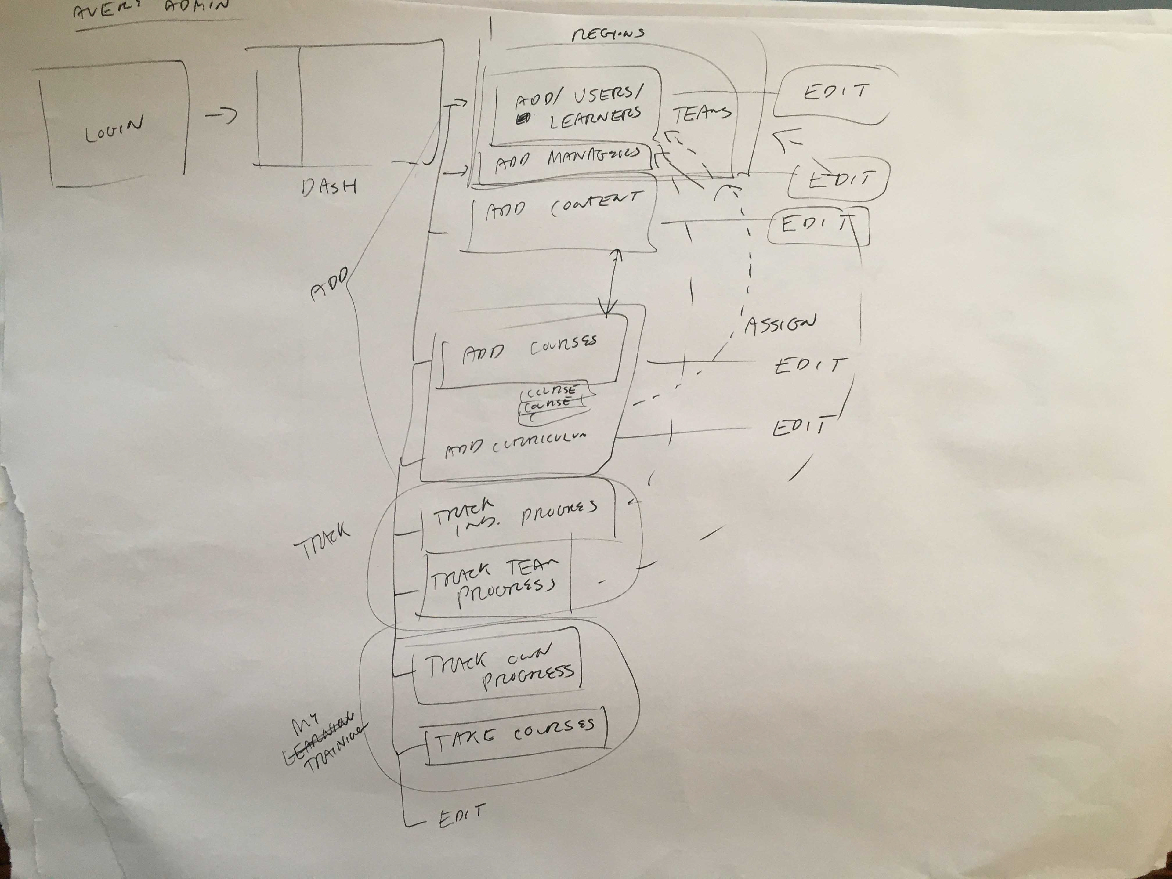
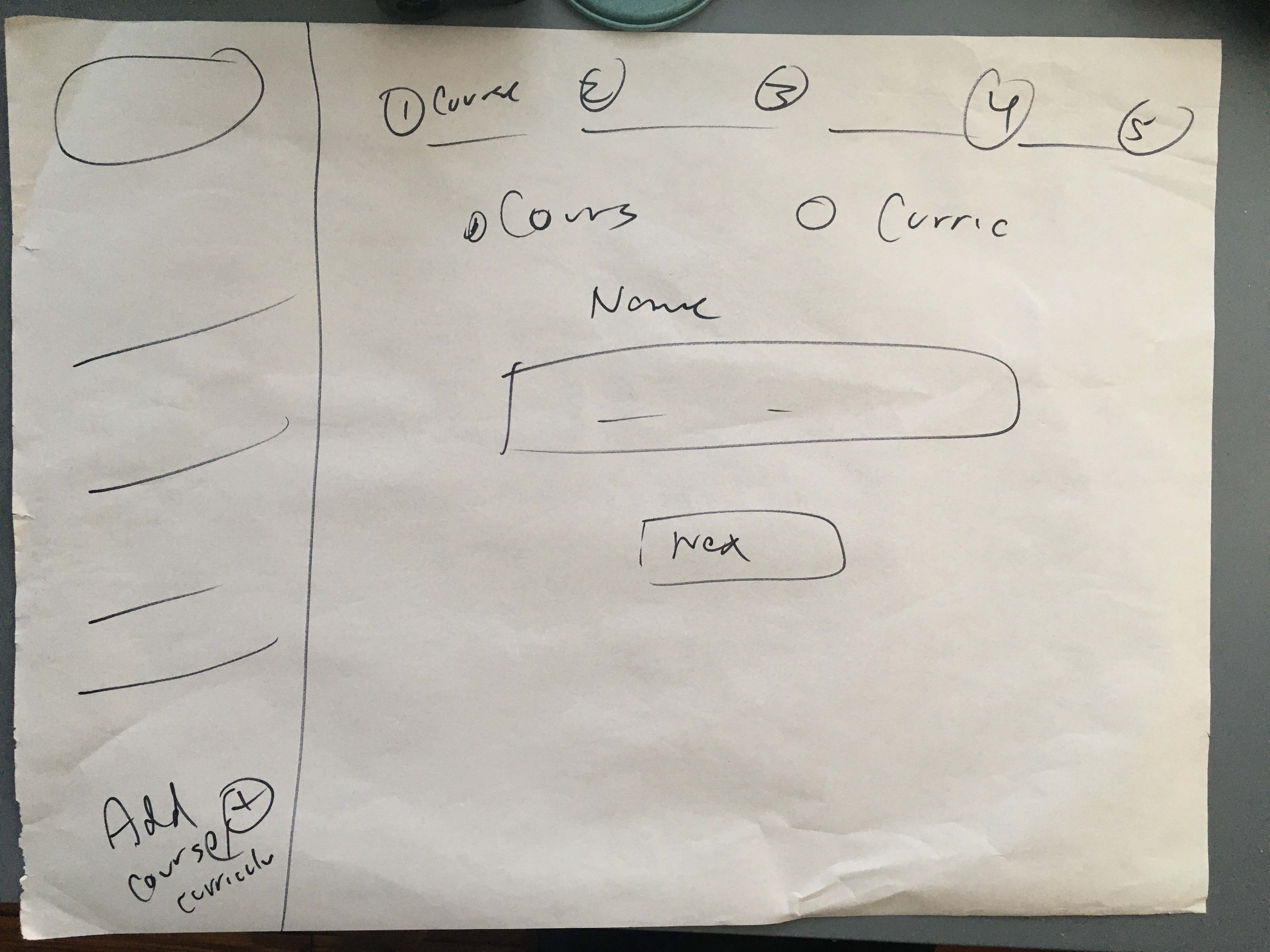
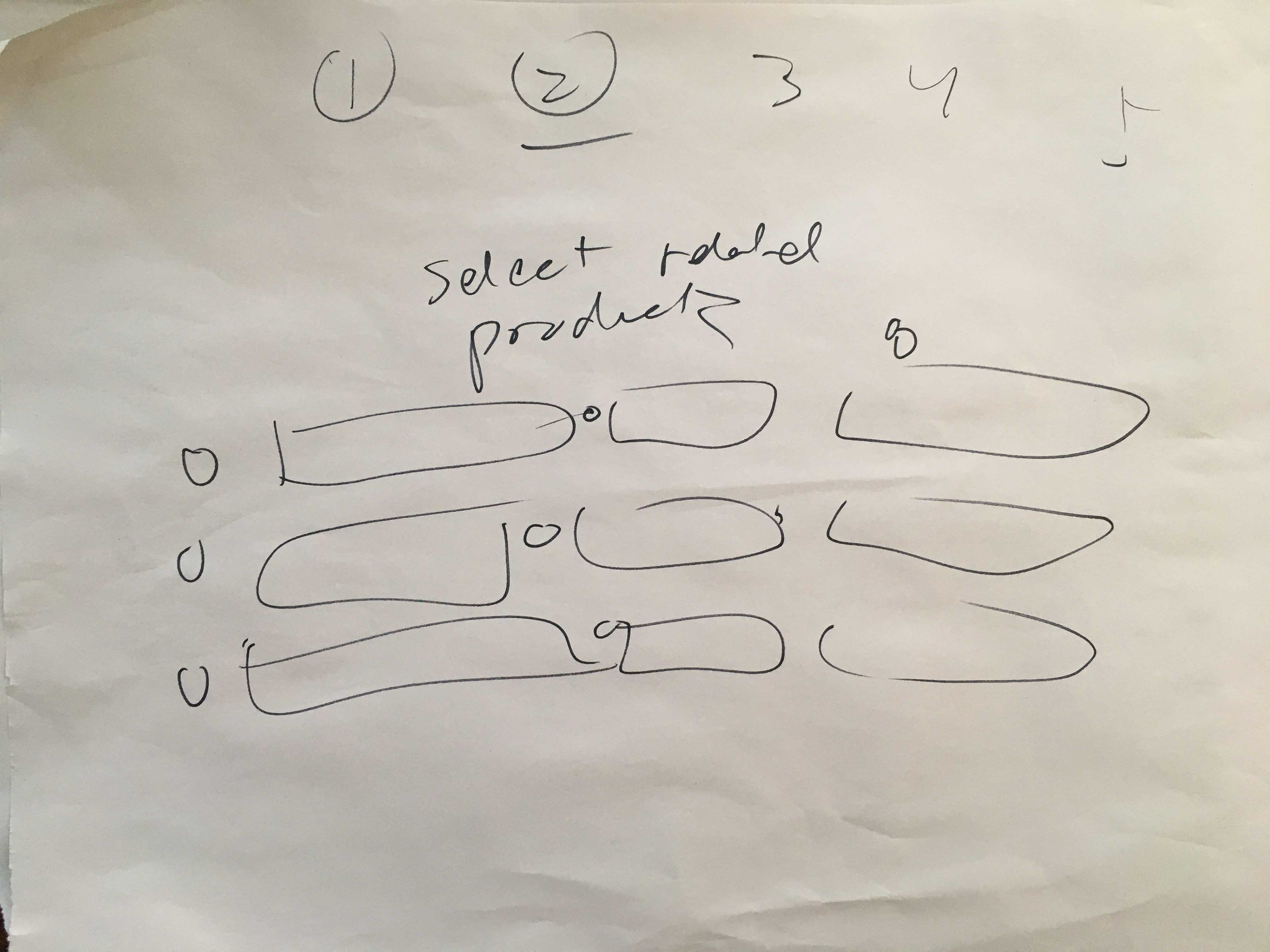
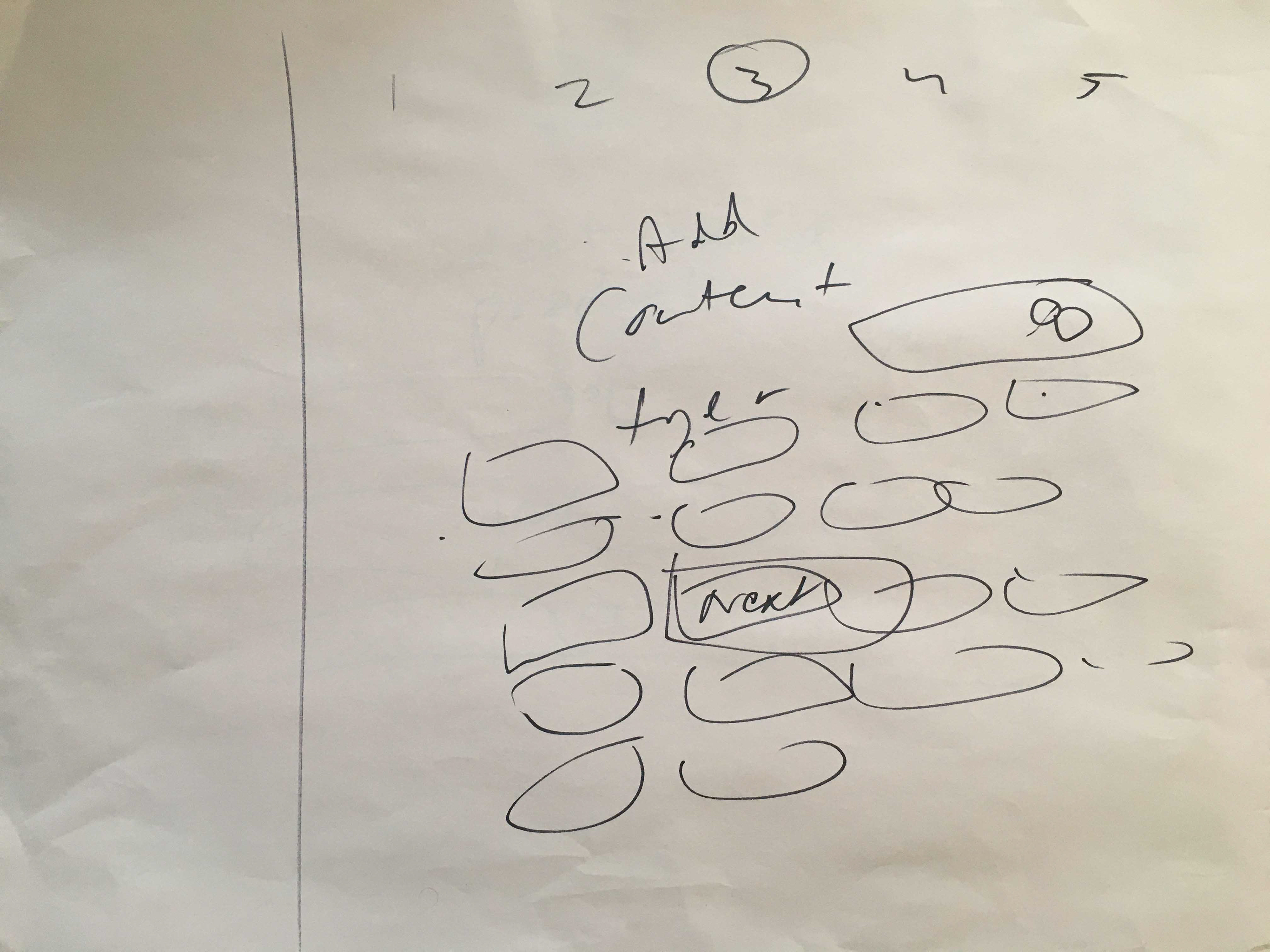
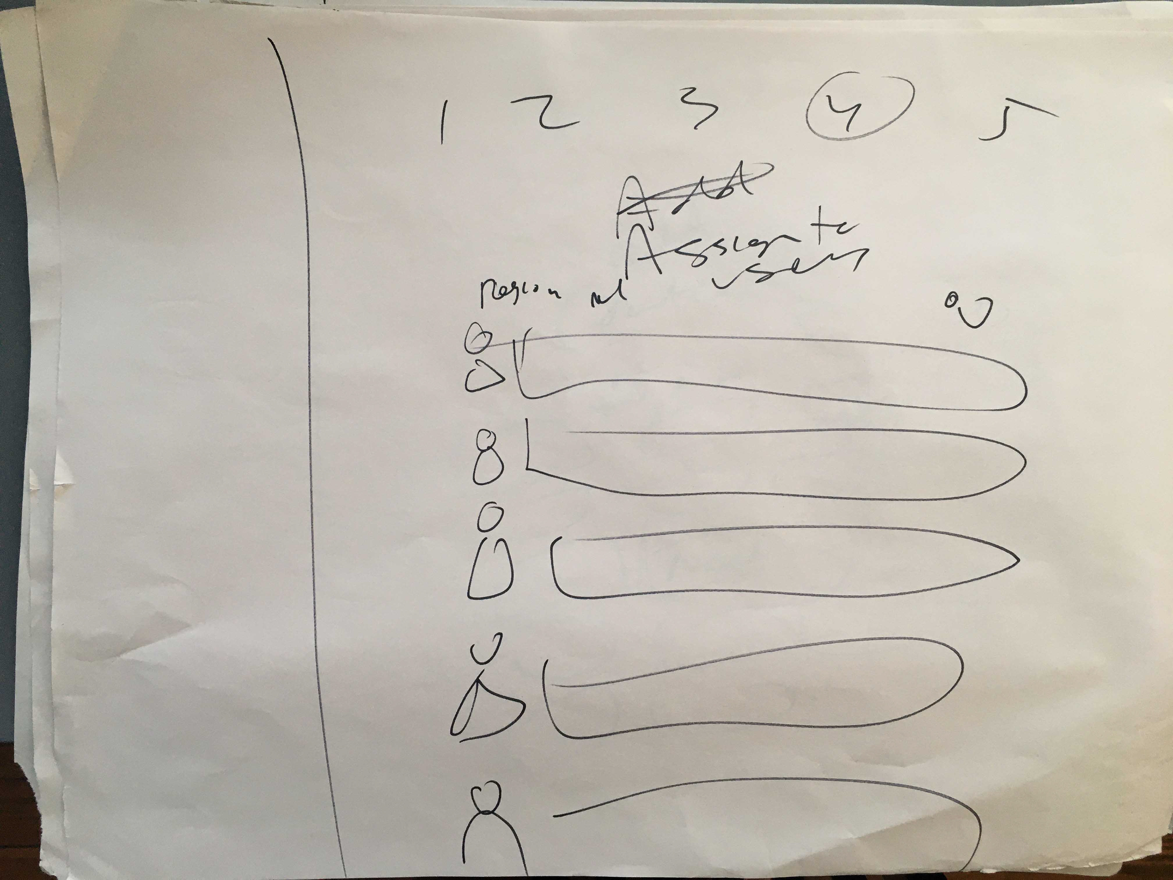
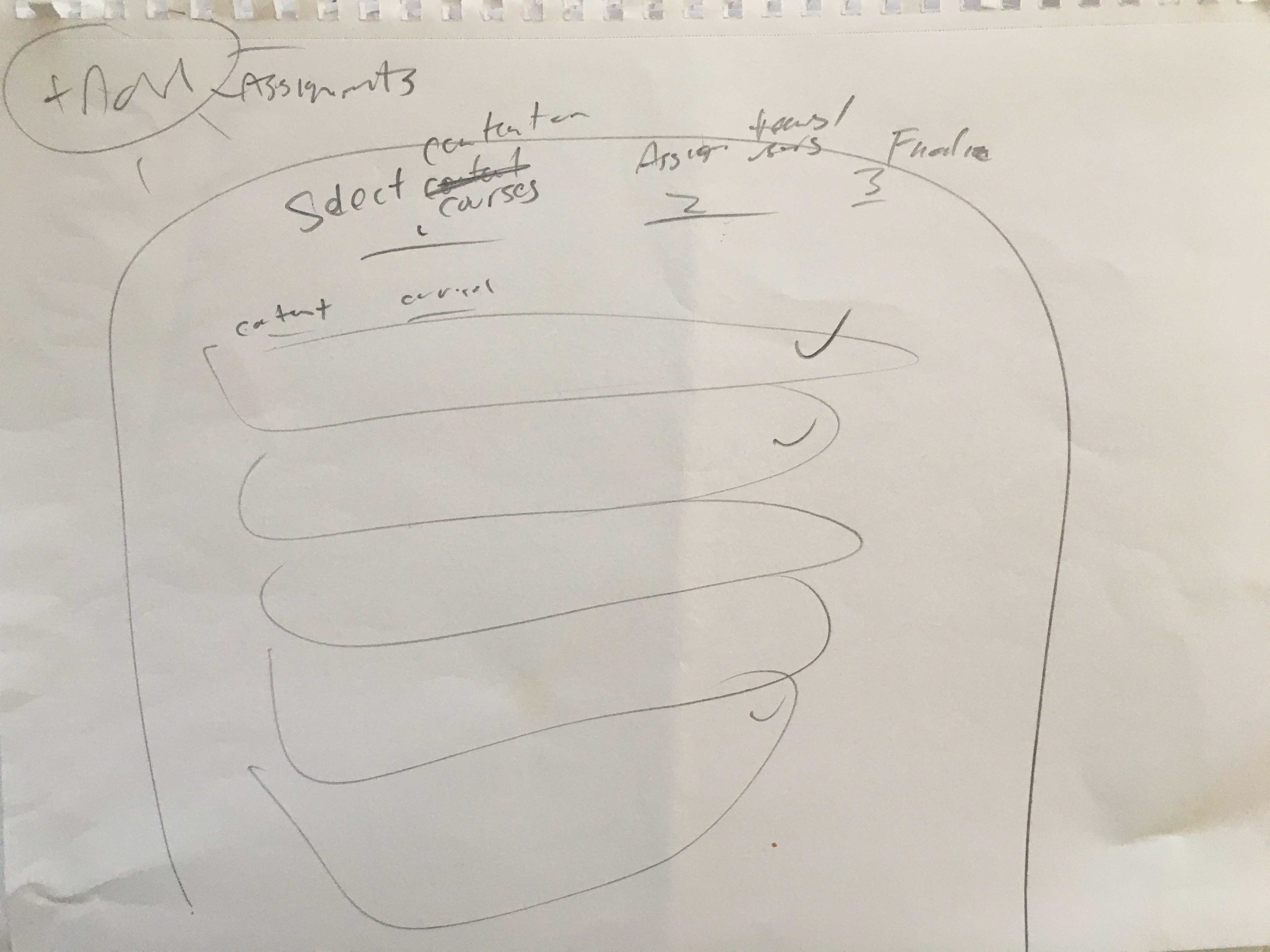
I always make sure to sketch out, quick and roughly, the entire system and get a working design pattern set up for all the key screens and flows. This rapid iterative sketching may not be pretty, but it seems to save the most time, as you can hammer out solutions cheaply, which also cements the vision in your mind. I've heard sketching called "cognitive supercharging" and couldn't agree more.
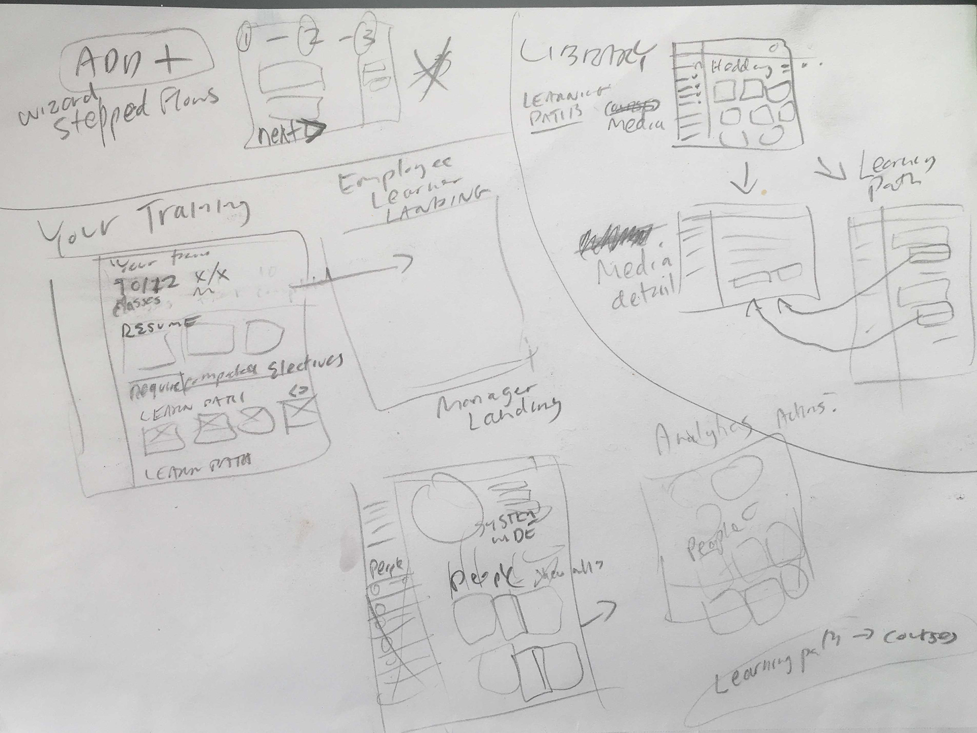
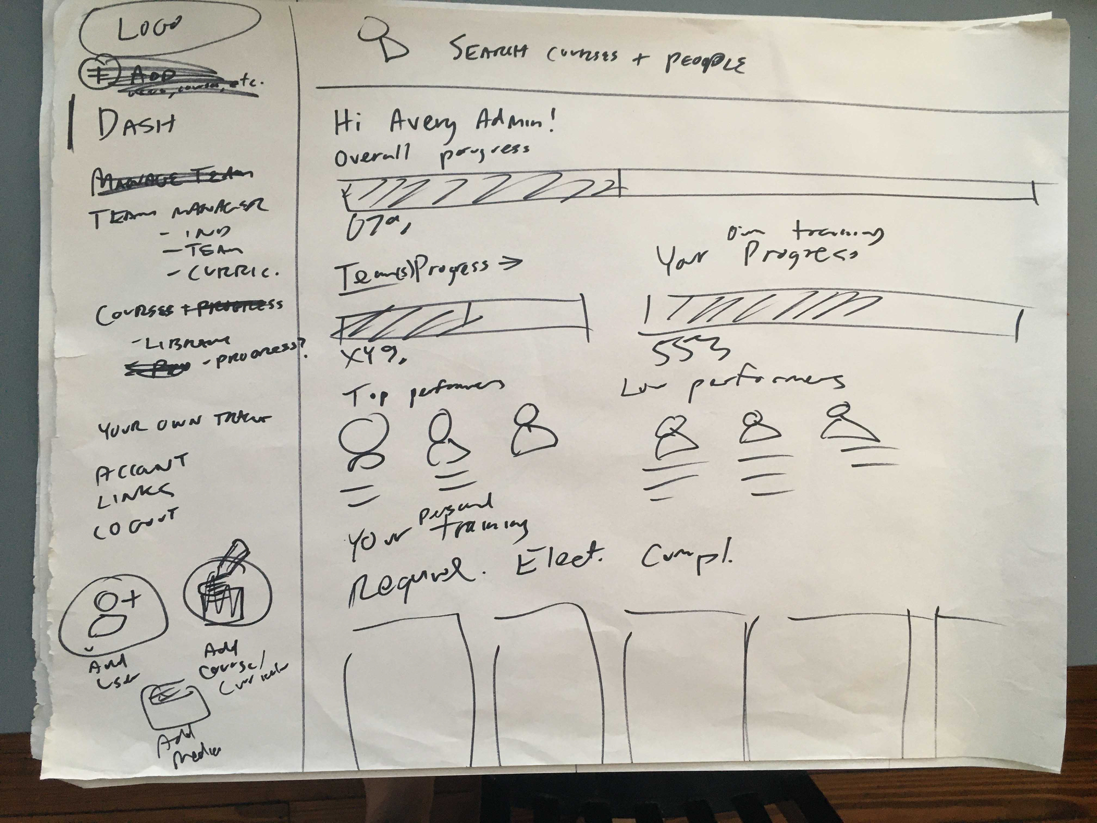
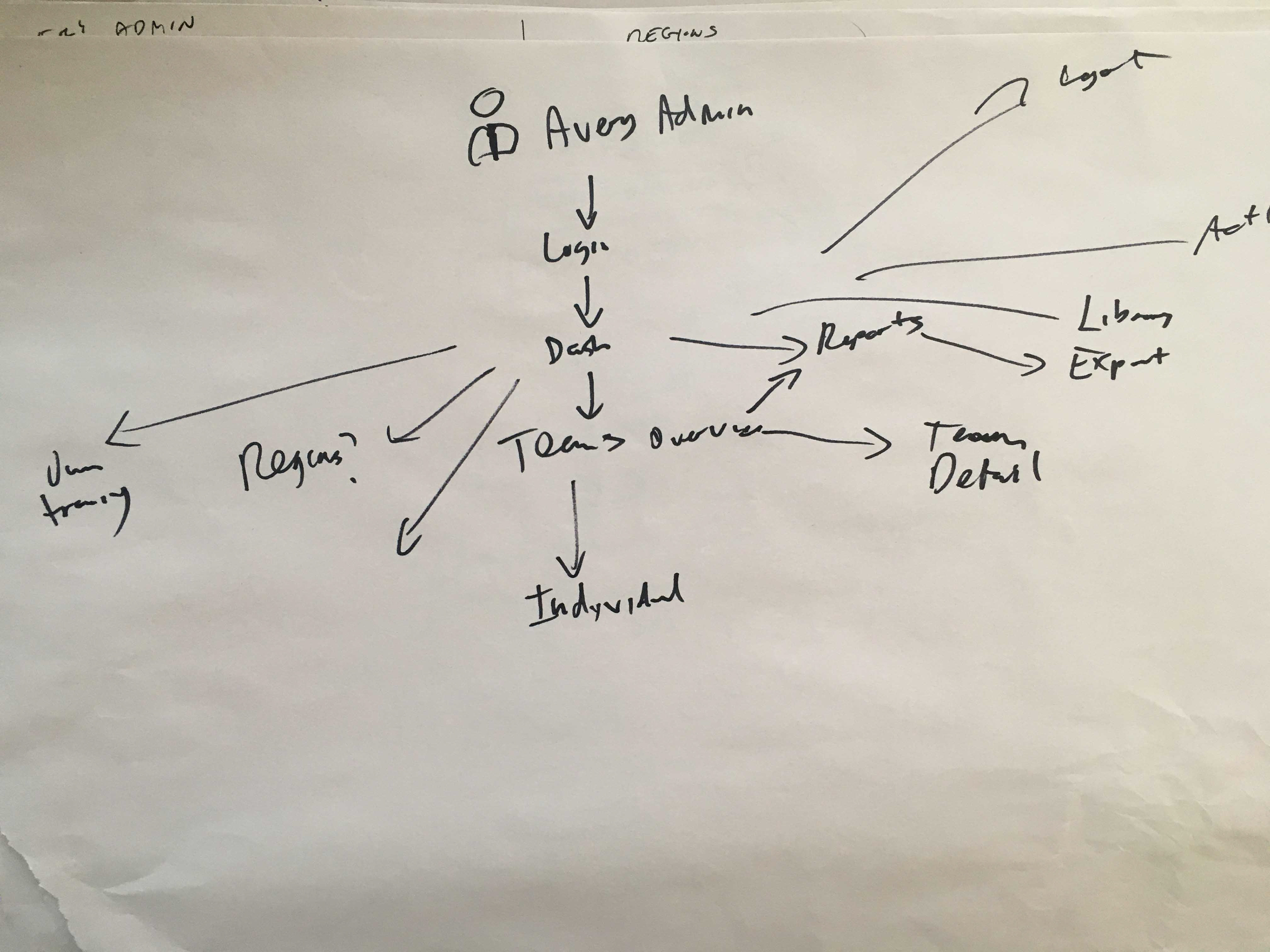
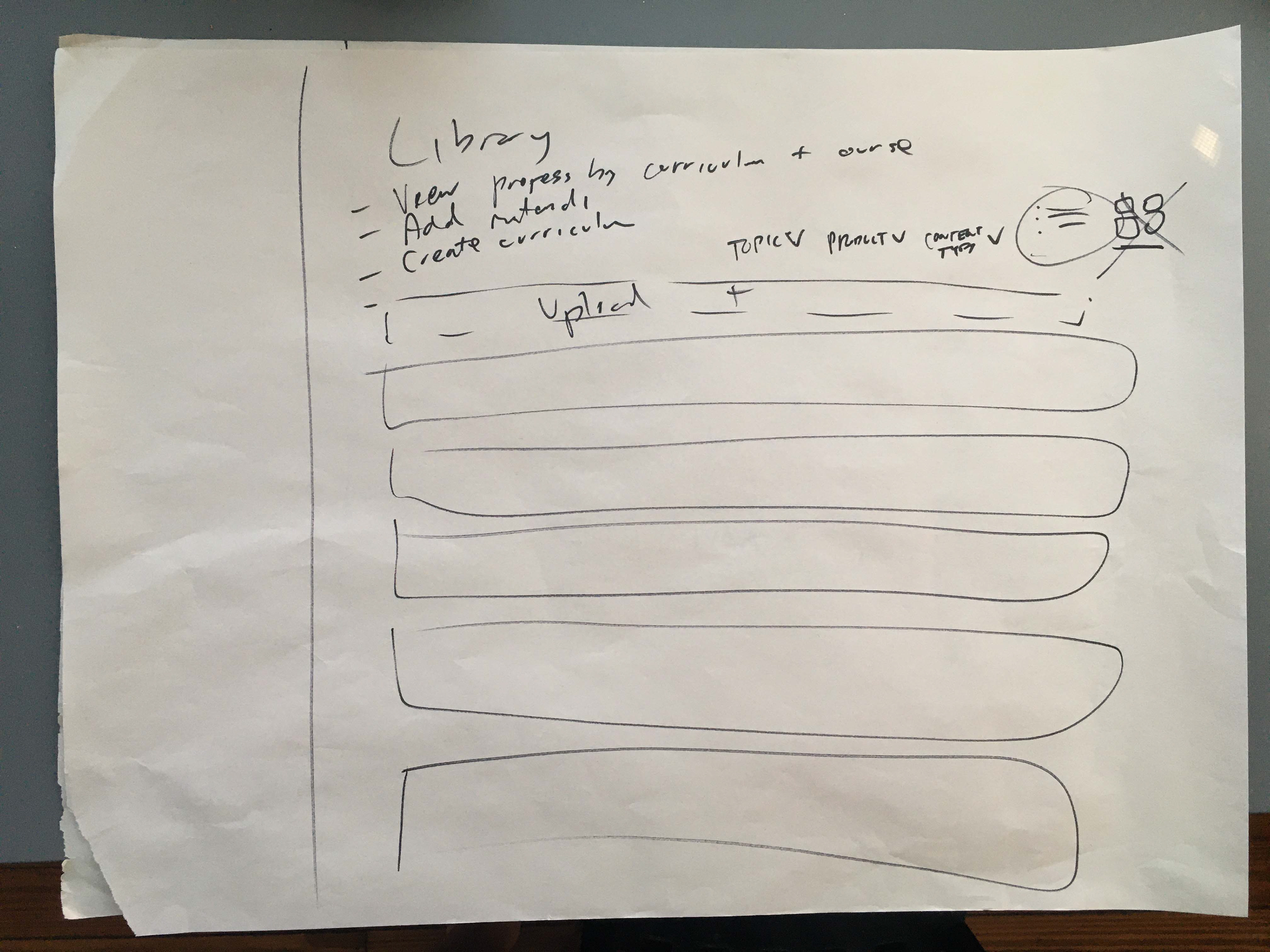
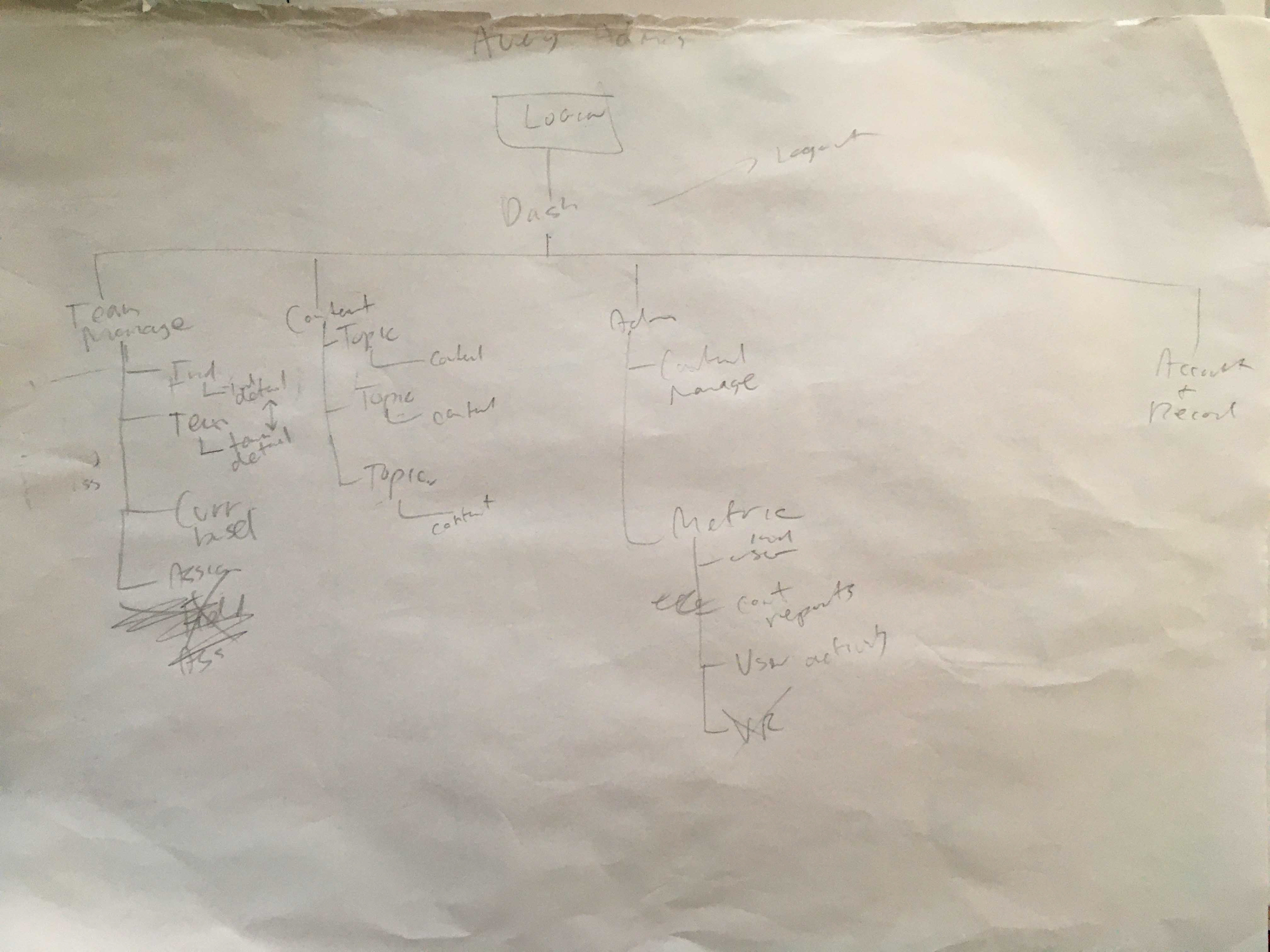
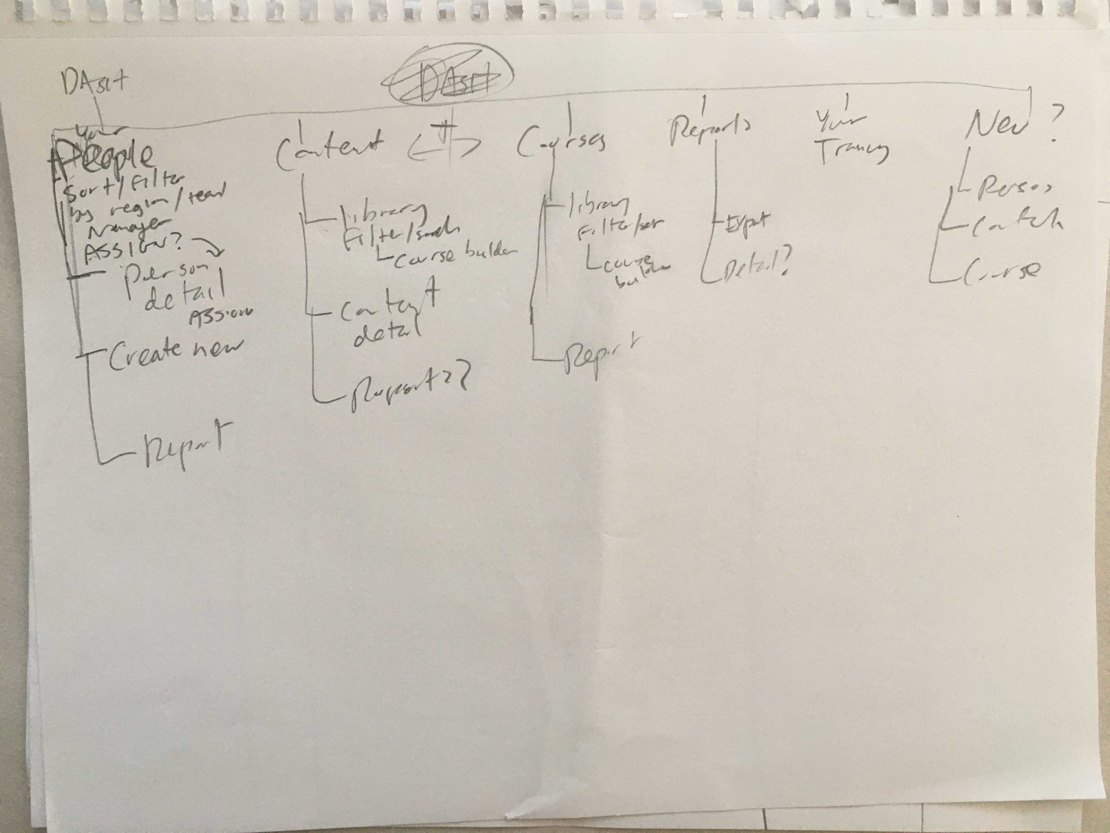
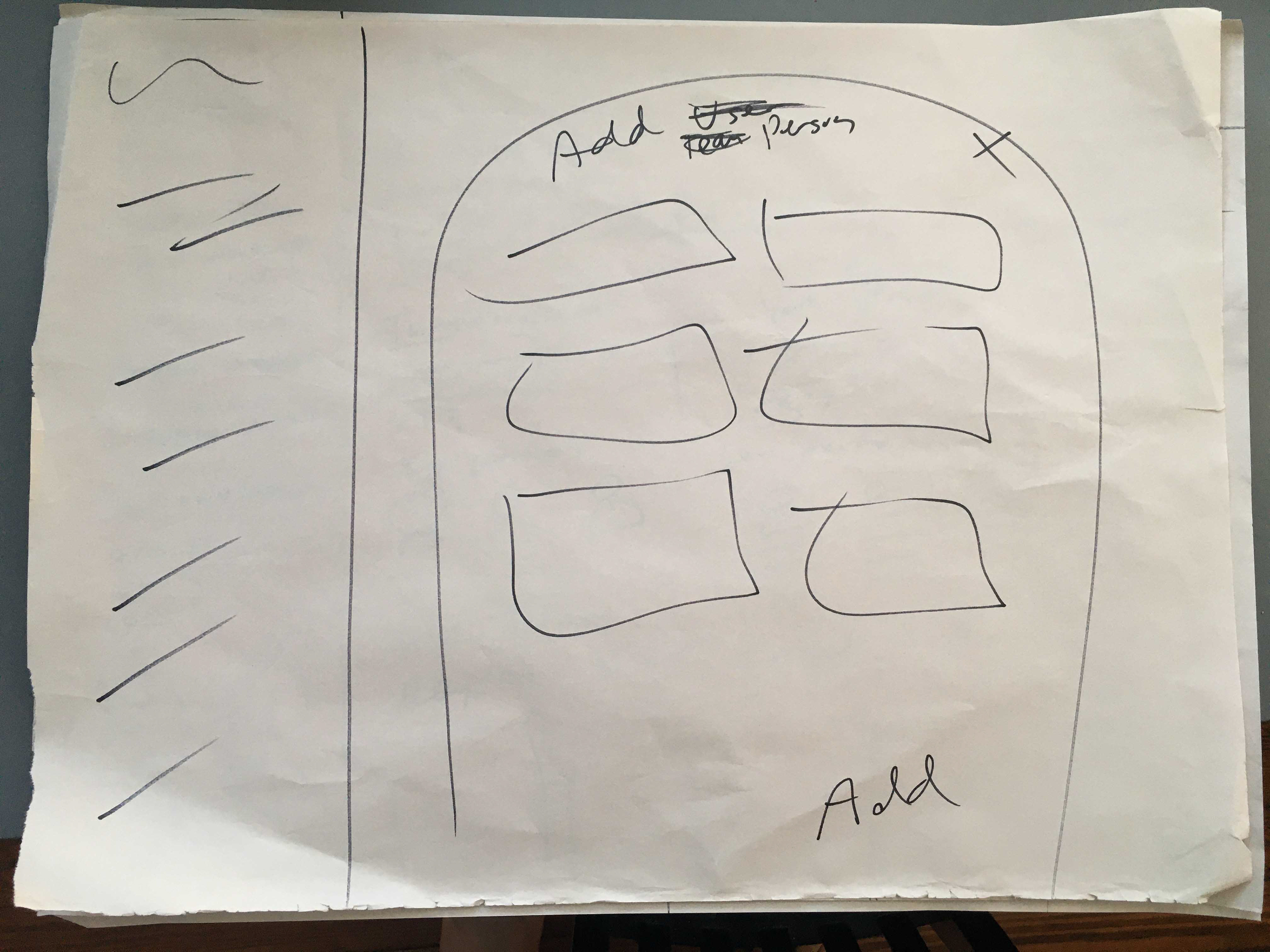
INFORMATION ARCHITECTURE BASED ON SKETCHES
IA was "mapped" to each persona's user journey. The user capabilities expand as the role grows from general employee up to manager and then super admin.
AFFINITY DIAGRAM + CONTENT/DATA INVENTORY/SORTING + HIERARCHY
To take stock of all the data and interactions possible, see how they are connected and weighting by importance. Special attention was taken by the team on the naming hierarchy of courses and course content . While I didn't necessarily agree with the choice by the stakeholder, I figured we could test it and address it later with users, hopefully. Also, there was plenty of other work to do so no need to get caught up in it when it works as a working hierarchy.
COLLABORATIVE WHITEBOARD WORKSHOPPING OF SOLUTIONS
Much of an entire day was taken reviewing sitemaps and user journeys and conceiving solutions on a whiteboard while continuing to gain an understanding of the existing platforms pain points.
LOW TO MEDIUM FIDELITY WIRE-FRAMING / PROTOTYPING
Over the course of the next few weeks over several iterations, the white-boarded solutions were fleshed out in clickable prototypes across several viewport widths. While the software will be responsive, it will mainly be used on desktop so we focused on that. Mobile screens were also tested to make sure the designs could scale down. Rather than mobile first, more "mobile concurrent" design (testing mobile views while working out desktop).
MOOD BOARDS
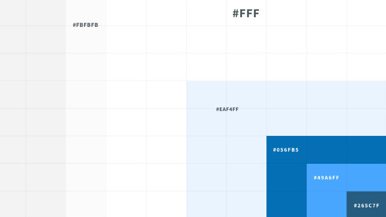
Finding a design aesthetic that is neutral enough that by selecting a key color it can be branded for their clients.
Initial hi fi super admin homescreen concepts
The goal of the screen is to allow admins at a glance viewing of progress and activity across the entire system, with the ability the quickly share and generate reports, or drill down further into individual teams and users. Executed by customizing/building on top of the google material design system.
Early VD Concept: Yet more variation
Stay tuned for more. Hopefully I can show you the prototypes in detail in person!

